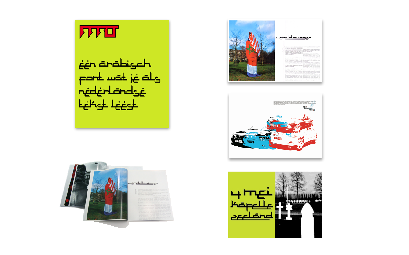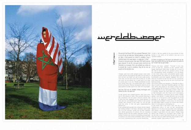

Role: co-creation concept & art direction | Agency: Hot DNA | Font design: www.toko.nu
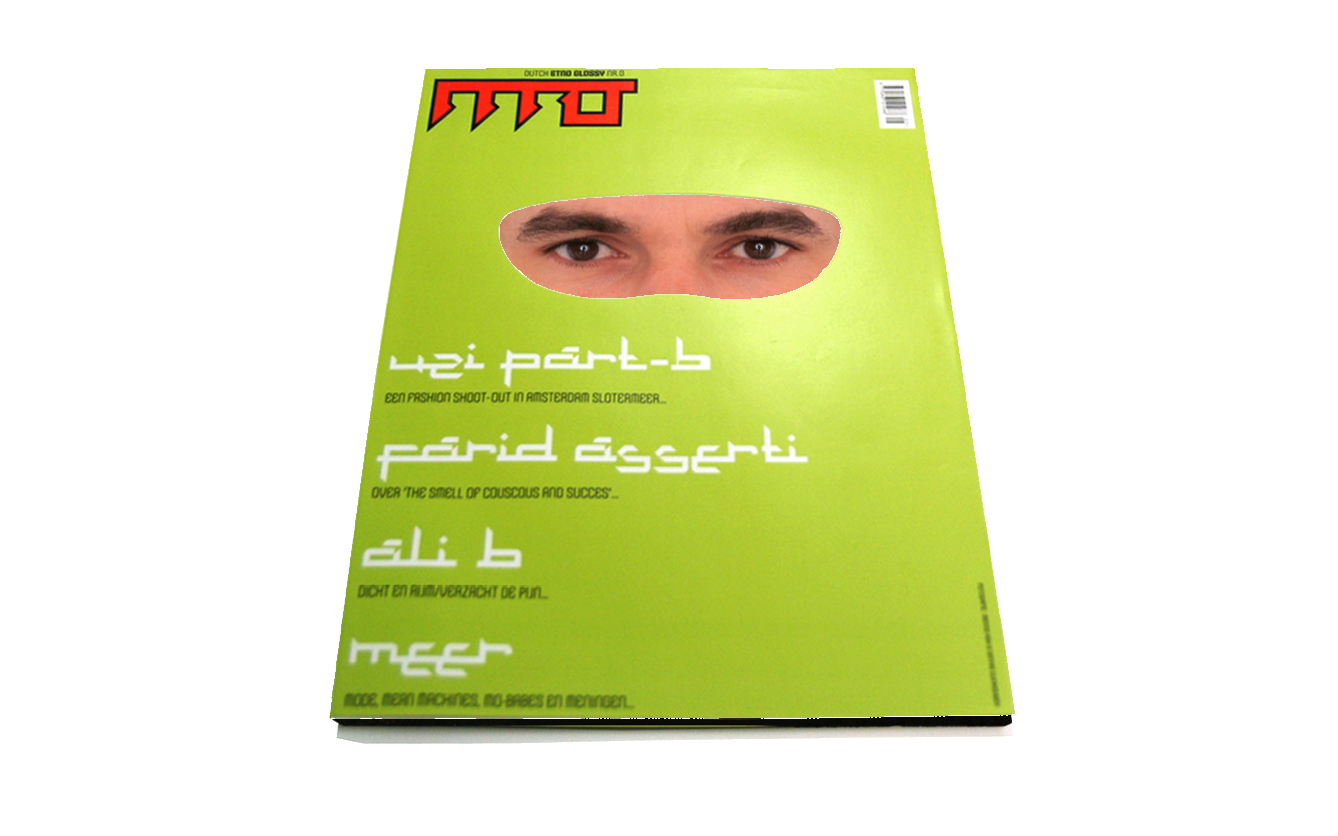
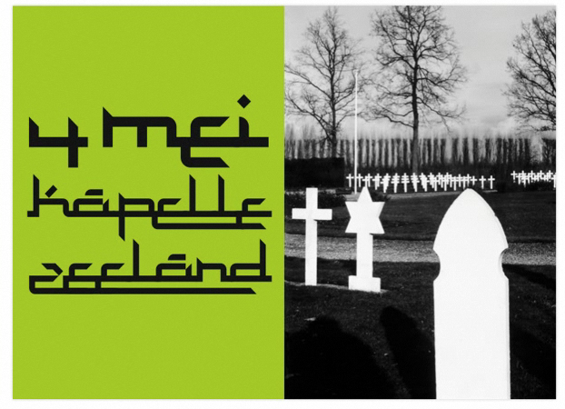
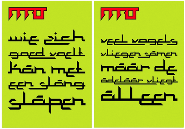
In march all over town bright green posters were appearing, with white type looking like Arabic writing.
On closer examination the messages turned out to be in Dutch, printed using an Arabic looking font. The posters were part of a campaign for the MO foundation, aimed at young people with a Morrocan background. MO wants to teach them self-respect, so they know how important respect is to other cultures in society. MO is an initiative of dutch creative Enrico Bartens.
Results: ADCN Award